Techniques for Specific Anime Elements

Alright, so we’ve got the intro out of the way, let’s dive into the nitty-gritty of coloring anime with Prismacolor pencils. This section will cover specific techniques for tackling hair, skin, eyes, and clothing – the major components of any anime character. We’ll focus on achieving that signature anime look while leveraging the versatility of Prismacolor pencils.
Hair Coloring Techniques
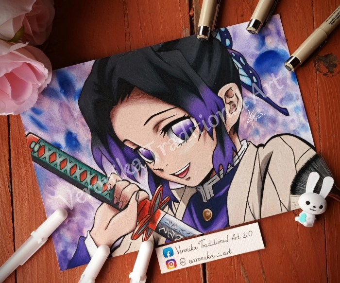
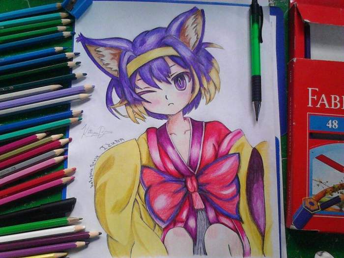
Coloring anime hair with Prismacolors involves more than just slapping on a single color. You need to consider the texture, highlights, and shadows to create depth and realism. For example, a character with short, spiky hair will require a different approach than one with long, flowing locks. We’ll explore how to build layers of color and utilize blending techniques to achieve different hair styles.
The key is layering light to dark, building up the color gradually.
- Base Color: Start with a light layer of your base color, ensuring even coverage. This establishes the foundation for subsequent layers.
- Shading: Use darker shades of your base color to add depth and dimension. Focus on the areas where hair would naturally recede or be shadowed.
- Highlights: Use lighter colors or even white to add highlights, emphasizing the strands and giving the hair a sense of shine. Consider the light source when placing highlights.
- Blending: Gently blend the colors together using a colorless blender pencil or your finger (lightly!). This smooths out harsh lines and creates a more natural look.
- Texture: For textured hair (e.g., spiky), use short, sharp strokes to mimic the individual strands. For smoother hair, use longer, more fluid strokes.
Skin Tone Rendering
Achieving realistic skin tones with Prismacolor pencils requires a nuanced approach to shading and highlighting. Anime skin often features a soft, almost porcelain-like quality, but it’s crucial to add subtle variations in tone to prevent it from looking flat. We’ll focus on creating believable depth and dimension by layering colors and using blending techniques.
- Base: Begin with a light peach or flesh tone as your base. This will be your foundation for building the rest of the colors.
- Shadows: Add subtle shadows using slightly darker peach or brown tones in the recesses of the face – under the nose, chin, and cheekbones. These should be soft and gradual transitions.
- Highlights: Use a very light peach or even a touch of white for highlights on the cheekbones, bridge of the nose, and forehead. These will catch the light and give the skin a luminous quality.
- Blush: A touch of light pink or red on the cheeks adds a natural flush. Blend it softly to avoid harsh lines.
- Blending: As with hair, blending is key to a smooth, realistic finish. Use light, circular motions to soften the transitions between colors.
Eye Coloring Techniques
Anime eyes are often large and expressive, and capturing their shine and depth is essential. We’ll look at creating realistic shine and depth using a combination of color layering and highlighting techniques. Think of the eye as a sphere, and consider how light reflects off its surface.
- Base Color: Start with the iris’s base color. This could be a variety of shades, from light blue to dark brown.
- Shading: Add darker shades of the base color around the pupil to create depth. Consider the light source when determining where the shadows fall.
- Highlights: Use a lighter shade or white to create highlights in the iris. These will give the eye a bright, shiny appearance. Place them strategically to mimic light reflection.
- Pupil: The pupil should be a solid, dark color. Leave a small, reflective highlight in the center to give it a realistic shine.
- Eyelid and Eyelashes: Use a light skin tone for the eyelid and a dark brown or black for the eyelashes. Pay attention to the direction and curvature of the eyelashes.
Clothing Coloring Techniques
Coloring clothing in anime involves capturing the fabric’s texture and the folds created by the character’s pose. Different fabrics have different textures and drape differently, so you need to adjust your technique accordingly. We will explore how to represent this with Prismacolors.
- Base Color: Start with a base layer of the clothing’s main color. Ensure even coverage.
- Shading: Use darker shades to create shadows in the folds and creases of the fabric. The direction of the shadows will depend on the light source and the fabric’s drape.
- Highlights: Use lighter shades to highlight the areas where light reflects off the fabric. This will add dimension and realism.
- Texture: Use different techniques to create different textures. For example, short, sharp strokes can mimic a rough texture, while longer, smoother strokes can create a softer look. Consider the type of fabric (silk, cotton, wool, etc.).
- Blending: Blend the colors smoothly to create a natural transition between light and shadow.
Advanced Techniques and Effects

Leveling up your anime coloring with Prismacolor pencils involves mastering advanced techniques to create truly captivating pieces. This goes beyond basic coloring and delves into manipulating texture, light, and shadow to achieve a professional, polished look. Think less “coloring book” and more “masterpiece.”
Creating Unique Textures and Patterns
Achieving realistic textures and intricate patterns is key to bringing your anime characters and environments to life. This involves varying pressure, layering, and blending techniques to mimic different materials like wood, fabric, or metal. For example, to create the texture of wood grain, you could use a light brown Prismacolor pencil with varying pressure to create light and dark lines, mimicking the wood’s natural striations.
Then, add darker browns and blacks in the recesses to create depth and shadow. To simulate the sheen of metal, a series of carefully layered light grays and silvers, blended smoothly with a colorless blender, will create the illusion of reflective surfaces. Experimenting with different pencil strokes, like hatching or cross-hatching, will further enhance the texture.
Achieving Special Effects
Special effects like glowing eyes or magical auras elevate your artwork to a higher level of visual storytelling. Glowing eyes can be achieved by layering light yellow, orange, and white pencils in the center of the eye, gradually darkening the color towards the edges. A touch of white pencil in the very center creates a pinpoint of light.
For magical effects, consider using a vibrant color scheme and a variety of blending techniques. For example, to depict a magical explosion, start with a core color (e.g., bright blue) and gradually layer lighter and brighter shades outward, creating a sense of energy and movement. Subtle blending with a colorless blender will give it a soft, ethereal glow.
Blending Techniques for Smooth Transitions
Smooth color gradients are crucial for realistic shading and depth. Prismacolor pencils lend themselves well to layering and blending. Start with light layers of color, gradually building up the intensity. Use a colorless blender to soften harsh lines and create smooth transitions between colors. Remember, less is more; avoid over-blending, which can result in muddy colors.
Yo, so I’m totally digging coloring anime with Prismacolor pencils, man, the blending is next level! But sometimes I need a break from all that detail, ya know? Check out these animal love coloring pages for a chill sesh, then it’s back to those anime eyes and hair – gotta get that perfect gradient, eh?
The key is to build up layers gradually and blend only where needed to create a soft, harmonious effect.
Creating Different Line Weights and Styles
Varying line weight and style adds dynamism and personality to your artwork. Use a light touch for delicate lines, and increase pressure for bolder strokes. Experiment with different pencil types – for example, harder pencils for fine details and softer pencils for broader strokes. Consider using a variety of techniques like hatching, cross-hatching, and stippling to create different textures and visual effects.
For instance, thin, precise lines can define fine details in hair or clothing, while thick, bold lines can emphasize character Artikels or dynamic action lines.
Illustrative Examples

Let’s dive into some concrete examples of how Prismacolor pencils can bring anime to life. We’ll explore character rendering, scene creation, and a before-and-after transformation to showcase the power of these pencils.
Character Rendering: A Determined Heroine, Coloring anime with prismacolor pencils
Imagine a young heroine, her fiery red hair (Prismacolor PC935, PC947, and PC1047 for highlights) cascading down her shoulders, partially obscuring a determined expression. Her eyes, a striking emerald green (Prismacolor PC902, PC901, and a touch of PC900 for depth), are focused intently on a distant point, reflecting a glint of light (Prismacolor PC1002). Her skin tone is a warm peach (Prismacolor PC946, PC944, and PC949 expertly blended), with subtle shading around her nose and cheekbones to emphasize her features.
She’s clad in a dark blue uniform (Prismacolor PC1013, PC1014, and PC1017 for shading), with highlights of a lighter blue (Prismacolor PC913) catching the light on the fabric’s folds. The intricate details of her uniform’s buttons and trim are meticulously rendered with fine-tipped pencils (Prismacolor PC935 for the smaller details). The overall effect is one of vibrant energy and unwavering focus, achieved through careful color selection and layering techniques, using lighter shades for highlights and darker shades for shadows.
Scene Creation: A Moonlit Forest Clearing
The scene depicts a moonlit forest clearing. The background is rendered using a deep indigo (Prismacolor PC1017) and black (Prismacolor PC900), gradually lightening towards the clearing to suggest depth. The moon, a pale, silvery disc (Prismacolor PC1011 and PC901), casts a soft glow on the trees, their leaves a deep green (Prismacolor PC903 and PC904) with hints of yellow (Prismacolor PC945) where the moonlight touches them.
The air itself feels cool and crisp, the effect created by using a range of blues and purples (Prismacolor PC1013, PC1017, and PC909) in the distant areas. The clearing itself is subtly lit, with long, slender shadows cast by the trees. A light wash of Prismacolor PC946 was used to suggest dew-kissed grass, creating a contrast with the darker background.
The entire scene uses a cool color palette to evoke a sense of quiet mystery and serenity. Layering and blending are key, with light layers of color carefully applied to create a smooth gradient from light to dark, mimicking the soft light of the moon.
Before-and-After Transformation
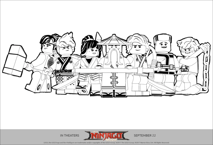
Before: A simple line art sketch of a girl with flowing hair and a determined expression, standing in front of a stylized cityscape. The lines are clean and precise, defining the basic shapes and features of the character and the background.After: The same girl now stands vibrant and full of life. Her hair, initially black lines, is now a cascade of deep blues (Prismacolor PC1013 and PC1017) and purples (Prismacolor PC909 and PC910), highlighted with lighter blues (Prismacolor PC913) to create depth and shine.
Her clothes, originally simple lines, are now detailed with a range of greens (Prismacolor PC903, PC904, and PC905) and yellows (Prismacolor PC945 and PC947), showcasing texture and shading. The cityscape background, previously a mere Artikel, is now a richly detailed scene, with buildings rendered in various shades of grey (Prismacolor PC900, PC901, and PC902), blues (Prismacolor PC1013, PC1014), and warm oranges (Prismacolor PC945 and PC947) to suggest warmth and depth.
The overall effect is a dramatic transformation from a simple sketch to a fully realized piece of anime art, showcasing the power of Prismacolor pencils to add depth, texture, and vibrancy.
Essential Questionnaire: Coloring Anime With Prismacolor Pencils
What paper is best for Prismacolor pencils when coloring anime?
Heavier weight paper, such as Bristol board or watercolor paper, is ideal for Prismacolor pencils as it prevents the paper from buckling or tearing under pressure from layering and blending.
How do I prevent Prismacolor pencils from breaking?
Sharpen your pencils with a quality sharpener designed for Prismacolor pencils. Use light pressure when coloring and avoid applying too much force.
How can I blend Prismacolor pencils smoothly?
Use a colorless blender pencil or a soft cloth to blend colors seamlessly. Layer colors gradually to achieve smooth transitions.
What is the best way to clean Prismacolor pencil marks from my hands?
Use a mild soap and water to gently wash away the pencil marks. For stubborn marks, try a baby wipe or a makeup remover.


